

In a digital-first world, your brand is shaped long before the first appointment.

The no-fluff guide for acupuncturists, chiropractors, therapists, doulas, herbalists, NPs, and every provider building a modern practice.

Automate your wellness business with these 5 simple workflows that save hours every week.
Discover how website design influences patient trust and conversion rates in healthcare.

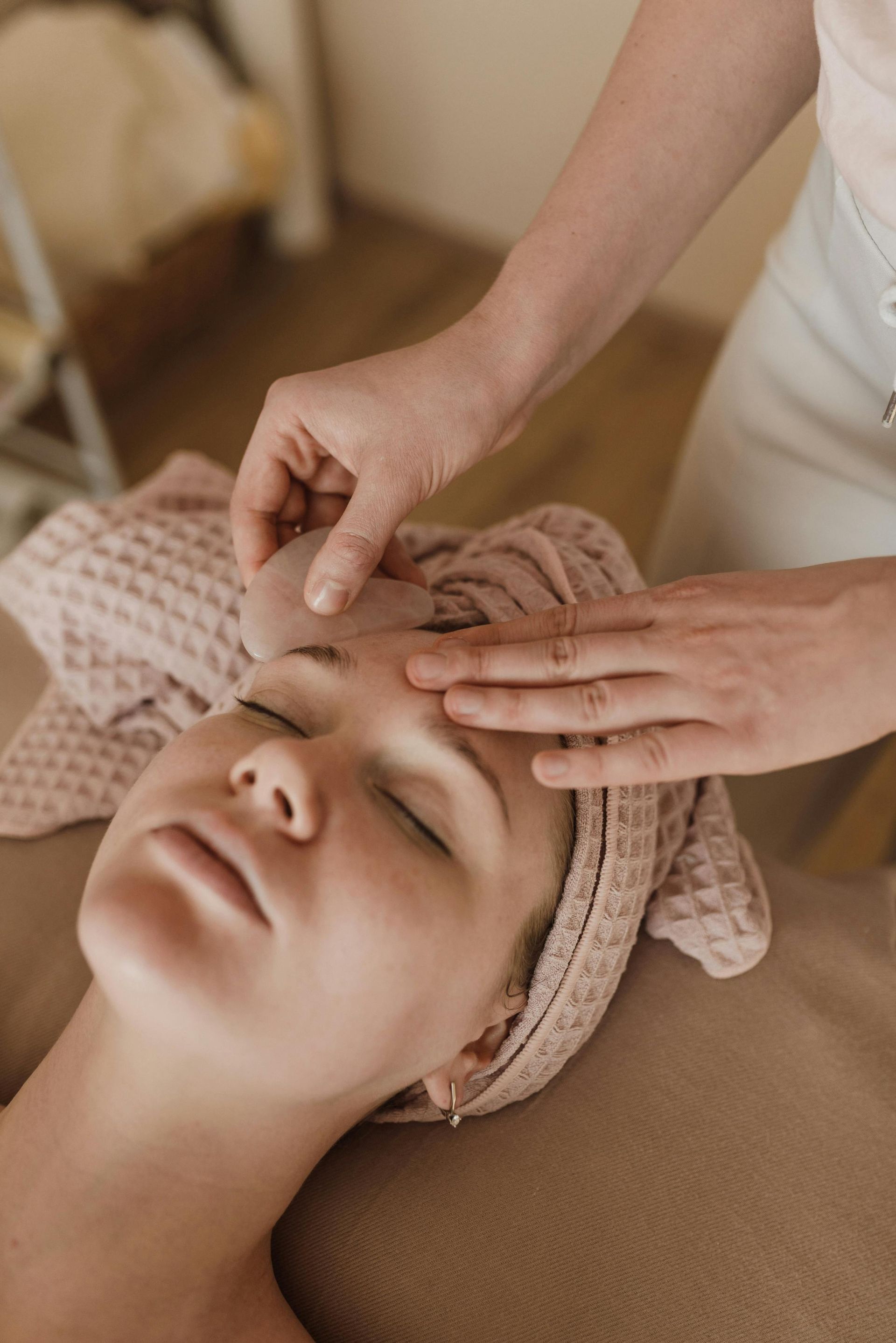
Learn how to design your online presence to build trust with patients before the first call.

Discover 5 simple SEO changes that help patients find and book your holistic practice online.

Learn how to grow your holistic practice in 2025 with smart systems, patient trust, and sustainable marketing.